Use visuals in Power BI

What is Power BI?
- Power BI is a group of software services, applications, and connectors that combine to transform your different sources of data into logical, engaging visuals, and interactive insights.
- Your data could be stored in a hybrid data warehouse that is both cloud-based and on-premises, or it could be an Excel spreadsheet.
- Power BI makes it simple to connect to your data sources, view the data, identify the key information, and share it with whoever you choose.
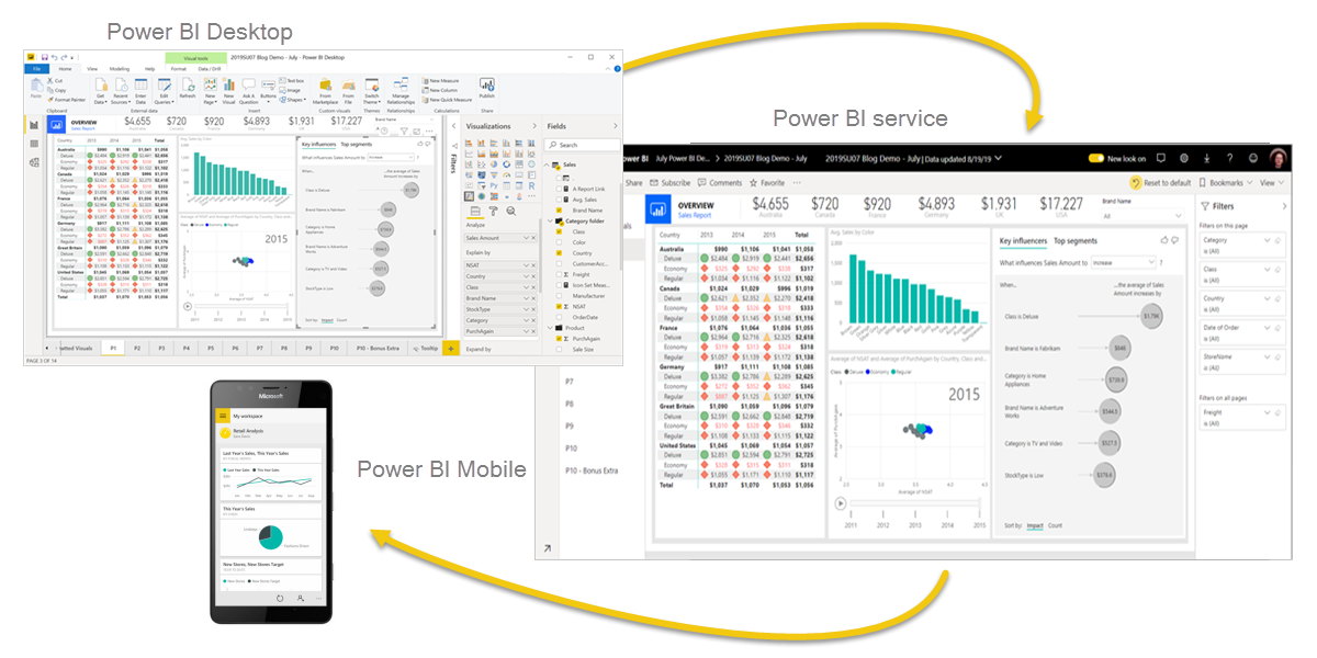
The parts of Power BI
Based with these three fundamentals, Power BI is made up of various components that all function together.
- Power BI Desktop is a desktop software programme for Windows.
- The Power BI service is a software as a service (SaaS) that is offered online.
- Windows, iOS, and Android mobile devices all support Power BI apps.
What is Power BI Desktop?
- You may connect to, transform, and visualise your data using Power BI Desktop, a free programme you can install locally on your computer.
- You can connect to numerous different sources of data using Power BI Desktop, and you can then integrate those sources (a process known as modelling) to create a data model.
- You can create visualisations and collections of visuals using this data model, which you can then share as reports with others in your company.
- When working on business intelligence projects, the majority of customers build their reports using Power BI Desktop, then share them with others using the Power BI service.
The following are the most typical applications for Power BI Desktop:
- Get the data.
- Create a data model by cleaning and transforming the data.
- Make graphics that offer visual representations of the data, such as charts or graphs.
- Make visual collections for your reports on one or more report pages.
- Utilize the Power BI service to share reports with other users.
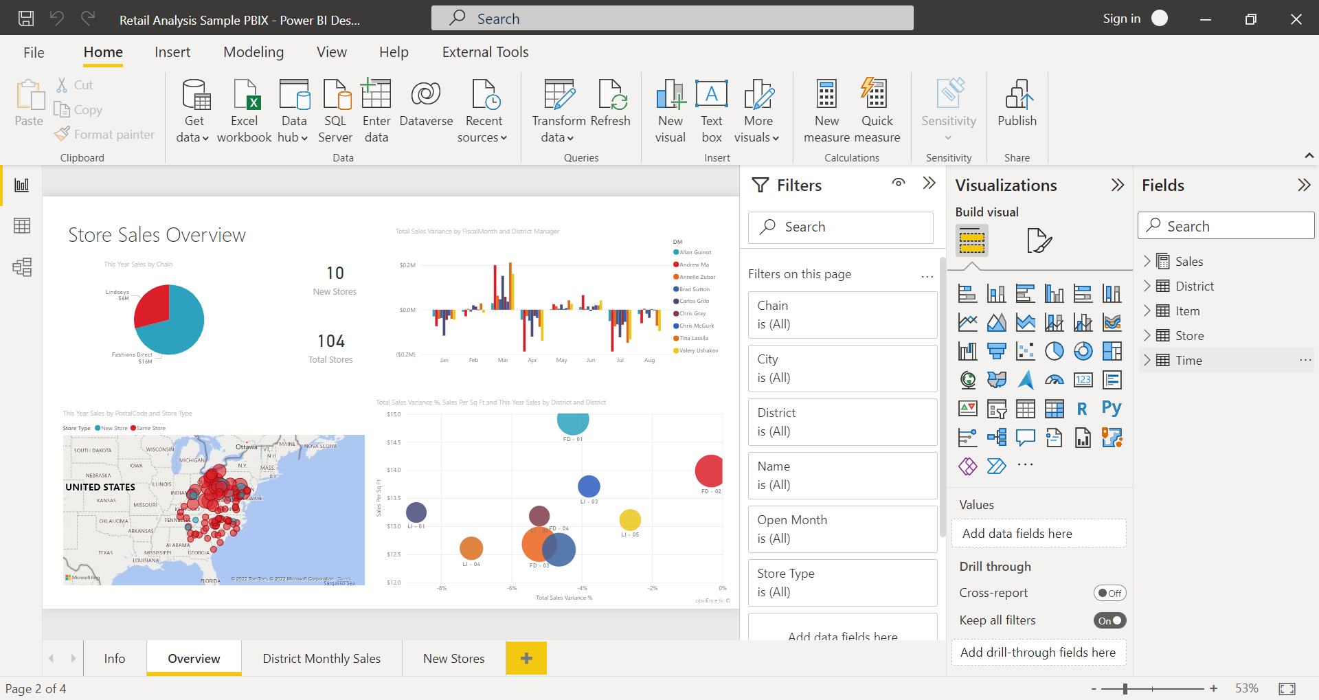
You can choose from three views in Power BI Desktop on the left side of the canvas. The following perspectives are presented in the order that they appear:
Report: The majority of your
creation time is spent on reports and visuals.
Data: You may access the tables,
metrics, and other information used in the data model for your report and
alter it to make the most sense for the model.
Model: In your data model, you can observe and
control the connections between tables
The three viewpoints are visible in the following image, which is located on the canvas' left side:
To Create any Power BI Desktop Views; we need to follow below steps:
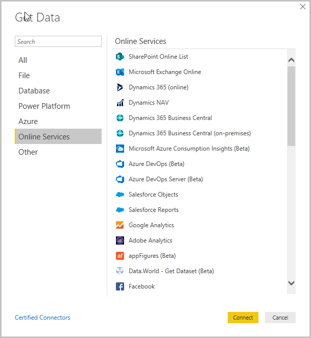
- Connecting to data
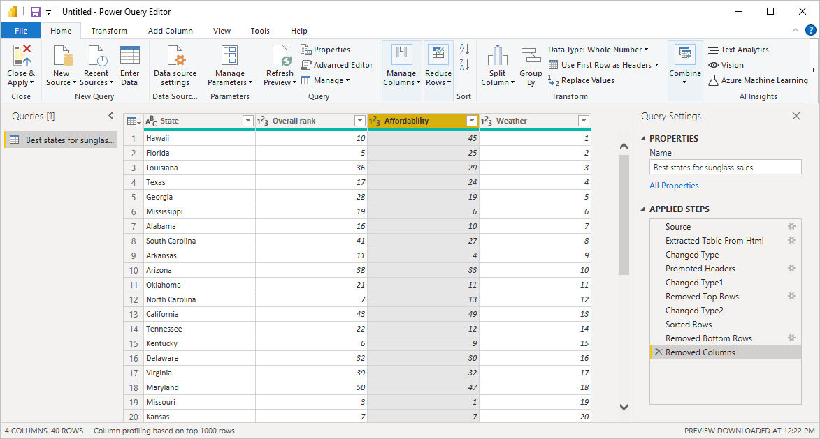
Connecting to data is the initial step in starting Power BI Desktop. You can connect to a wide range of different data sources using Power BI Desktop.
- Select the option Get Data > More from the Home ribbon.
- When Power BI Desktop connects, it may access a wide range of categories, which are displayed in the Get Data box.
2. Transform and clean data, create a model
Using the Power Query Editor that is present in Power BI Desktop, you may clean and alter data.
- You can alter your data with Power Query Editor, including altering the data type, eliminating columns, or integrating data from other sources.
- Similar to sculpture, you begin with a massive block of clay (or data), then cut away or add to it as necessary to achieve the desired shape.
- Power Query Editor keeps track of every action you do while modifying data, including renaming tables, changing data types, and deleting columns.
- These actions are taken each time this query establishes a connection to the data source, ensuring that the data is always shaped the way you want.
- We may apply calculations to any columns required in power query editor.
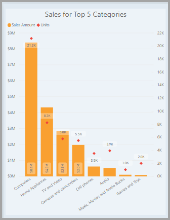
Power BI Desktop offers a wide variety of visual kinds to pick from.
- You can drag fields onto the report canvas once you have a data model to produce graphics.
- An illustration of the data in your model is a visual.
- An easy column chart is displayed in the following image.
4.Create reports
Using data from many sources, you can generate complicated and visually appealing reports with Power BI Desktop that you can share with others in your company.
- To build a set of Power BI Desktop visualisations that illustrate different components of the data you used to build your model.
- A report is a group of graphics contained in a single Power BI Desktop file.
- Similar to how an Excel file can include one or more worksheets, a report can have one or more pages.
5. Share reports and Publish
When a report is ready to be shared, you can upload it to the Power BI service and make it accessible to anybody in your company who has a license for the service.
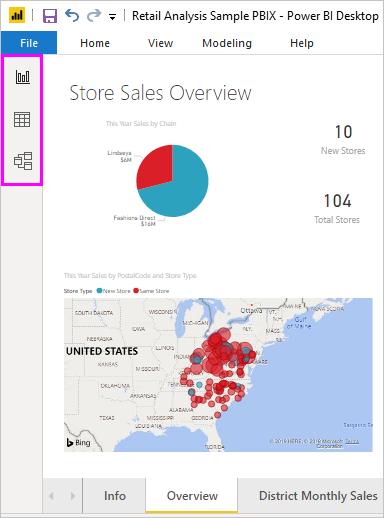
- For a Power BI Desktop report to be published.
- Publish can be chosen from the home ribbon.
Power BI Desktop screenshot with the Publish button visible.
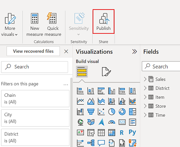
- With your Power BI account, Power BI Desktop connects you to the Power BI service.
- Power BI prompts you to choose the area in the Power BI service where you'd like to share the report, such as your workspace, a team workspace, or another place.
- To share reports to the Power BI service, you need a license for Power BI.
Visuals in Power BI Desktop
Once we have the data and we have transformed the data; the most important part is selecting the proper visual.
For this we can leverage the visualization pane on the left hand side and use the best suitable visual .
To help you understand visuals better lets implement it in a few examples:
Example 1: Create a film report using Microsoft
Power BI to show Director wise Films as per Genres and all the director; List
of all Director Names with Gender and Genre Types.
Steps
Used to Implement in Power BI
- Import Data – Excel files- Director, Genre, Films
- Extract Data – The Selections of tables
- Transform the data – To transform the columns required only
- Load Data – In Power BI will load the tables transformed
- Model – Set up relationship between tables
- Calculation-None
- Create Report by using Visuals - Set up visuals by tables and change the properties and format the same on all three tables- filters and Vis
- Publish the Report in Power BI Desktop

Example 2: Create a Certificate report using Microsoft Power BI to show Matrix view of the Count of films by Certificate rating and Genre.
Steps Used to Implement in Power BI
- Import Data – Excel files- Certificate, Genre, Films
- Extract Data – The Selections of tables
- Transform the data – To transform the columns required only
- Load Data – In Power BI will load the tables transformed
- Model – Set up relationship between tables
- Calculation-Count no of films as per genre
- Create Report by using Visuals - Set up visuals by Matrix and change the properties and format the view
- Publish the Report in Power BI Desktop

Steps Used to Implement in Power BI
- Import Data – Excel file- Airline
- Extract Data – The Selections of table
- Transform the data – To transform the columns required only and transform
- Load Data – In Power BI will load the tables transformed
- Model – No relationship was setup
- Calculation-None
- Create Report by using Visuals - Set up visuals by Clustered column chart and line-stacked column and change the properties and format the view
- Publish the Report in Power BI Desktop

- Show the trend of Sales and Profit every month,
- Track the Count of orders delivered and returned month wise,
- Check the orders received as per the Product Category,
- View the orders by Shipment Mode,
- Analyze the Sales and Profit as per the Customer Segment,
- View the count of Order.
Steps Used to Implement in Power BI
- Extract the Data (We have one excel
file with 5 tabs) we will import the 1 excel file with 5 sheets (Customer, Product,
Return, Sales Data, User))
- Transform the Data as mentioned
above clearly.
- Load the Data (Post transforming the
data we will load the data)
- Build the Model (Set up the
relationships that are mentioned above)
- Create some Calculations (In this
case it’s not required)
- Report has been uploaded
- Publish the report

· Total number of visuals / Report
- First Slicer Visual for filter for Product Category; Customer Segment; Customer Name; Order Date
- Data cards for Total Sales; Total Profit; Order Delivered; Order Returned
- Line Chart for sales and profit by month.
- Clustered column chart for order delivered and returned by month
- Clustered bar chart for sales and profit by customer segment.
- Donut Cart for Profit by Product category.
- Tree graph for quantity ordered by product container.
- Donut chart for quantity ordered by ship mode
- Matrix to View Sales and Profit Raw Data

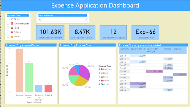
Example 5: To create power BI reports and Dashboard by analyze the Expenses raised by Employees. And as an HR to view total no of requests pending, approved by manager/HR, rejected, and also to analyze the amount with reference to expenses type.
Steps Used to Implement in Power BI
- Extract the Data we will import using Online Service and Select Lists
- Transform the Data as mentioned above clearly.
- Load the Data (Post transforming the data we will load the data)
- Build the Model (Set up the relationships that are mentioned above)
- Create some Calculations
- Report has been uploaded
- Publish the report
Total number of visuals / Report
- First Slicer Visual for filter for
- Data cards for Total Expense Amount till date; Total Expenses Raised; Average Expense Amount; Last Expense ID Raised
- Stacked Column Chart for Expense wise Approval Status .
- Donut Cart for Expenses raised by Expense Type.
- Matrix to View Expense ID’s for Amount requested and Approval Status


Comments
Post a Comment